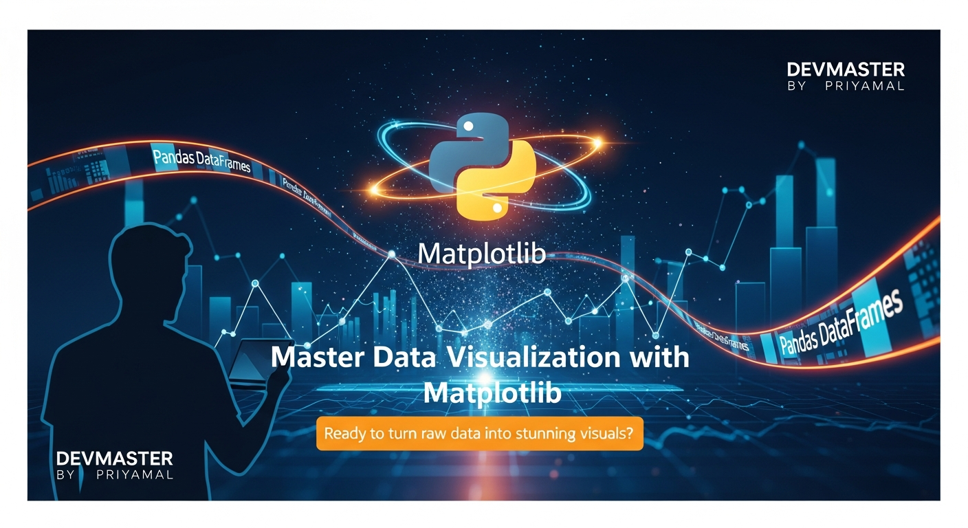
Python Matplotlib Data Visualization Sinhala | දත්ත දර්ශන (Data Visualization) Python Matplotlib සමග
කොහොමද යාලුවනේ! අද අපි කතා කරන්න යන්නේ Data Science සහ Python වලින් data analyze කරන කෙනෙක්ට නැතුවම බැරි tool එකක් ගැන. ඒ තමයි Matplotlib. නිකන් data තියෙනවාට වැඩිය ඒක graph එකක් විදිහට, visual එකක් විදිහට බලද්දි අපිට ඉක්මනට තේරුම් ගන්න පුළුවන් නේද? Matplotlib කියන්නේ Python වලින් high-quality, static, interactive වගේම animated visualizations හදන්න පුළුවන් පුදුම powerful library එකක්. මේකෙන් පුළුවන් data points වල patterns, trends, සහ outliers වගේ දේවල් ඉතා පැහැදිලිව පෙන්නන්න. විශේෂයෙන්ම academic papers, reports, සහ presentations වලදී මේක ගොඩක් වැදගත්.
අද මේ tutorial එකෙන් අපි Matplotlib වල මූලික දේවල් ඉගෙන ගන්නවා. ඒ කියන්නේ:
- Matplotlib කියන්නේ මොකක්ද සහ ඒකේ මූලික සංකල්ප (Figure, Axes) මොනවාද කියලා.
- මූලික plot වර්ග (Line, Bar, Scatter) කොහොමද භාවිත කරන්නේ කියලා.
- ඔයාගේ plots තව ලස්සනට customize කරගන්නේ කොහොමද කියලා.
- හොඳ data visualization එකක් හදාගන්න පුළුවන් Best Practices සහ Troubleshooting tips.
ඉතින්, අපි පටන් ගමු!
Matplotlib කියන්නේ මොකක්ද? (What is Matplotlib?)
Matplotlib කියන්නේ Python ecosystem එකේ තියෙන ඉතාම ජනප්රිය ploting library එකක්. මේක 2003 දී John Hunter විසින් ආරම්භ කළේ MATLAB වල තිබ්බ ploting functionality එක Python වලට ගේන්න. කාලයත් එක්ක Matplotlib ගොඩක් දියුණු වෙලා දැන් Data Scientists ලා, Researchers ලා අතර ඉතාම ප්රචලිත tool එකක් බවට පත්වෙලා.
Matplotlib වල මූලිකම සංකල්ප දෙක තමයි Figure එකක් සහ Axes එකක් කියන්නේ. මේක හරියට කැන්වස් එකක් සහ ඒක උඩ අඳින චිත්රයක් වගේ හිතන්න පුළුවන්.
- Figure (රූපය): මේක තමයි ඔයාගේ plot එකේ සම්පූර්ණ window එක. ඒ කියන්නේ ඔයාගේ graphs එකක් හරි කිහිපයක් හරි තියෙන මුළු කැන්වස් එක.
- Axes (අක්ෂ): මේක තමයි ඇත්තටම අපේ data plot වෙන්නේ. X අක්ෂය සහ Y අක්ෂය තියෙන, title එකක්, labels තියෙන area එක. Figure එකක Axes එකක් හරි කිහිපයක් හරි තියෙන්න පුළුවන්.
මේ සංකල්ප දෙක තේරුම් ගැනීම Matplotlib එක්ක වැඩ කරද්දි ගොඩක් වැදගත්.
මූලික Plot වර්ග සහ භාවිතය (Basic Plot Types and Usage)
Matplotlib වල ප්රධාන plot වර්ග කිහිපයක් තියෙනවා. මේවා data set එකේ ස්වභාවය අනුව තෝරාගන්න එක තමයි වැදගත්.
1. Line Plot (රේඛා සටහන)
ටයිම් සීරීස් data (time-series data) හරි, එක continuous variable එකක් තවත් continuous variable එකක් එක්ක කොහොමද වෙනස් වෙන්නේ කියලා බලන්න හරි Line Plot එක හොඳම විකල්පය. උෂ්ණත්වය වෙනස් වෙන විදිහ, කොටස් වෙළඳපොළේ මිල ගණන් වගේ දේවල් පෙන්නන්න මේක ගොඩක් හොඳයි.
2. Bar Plot (තීරු සටහන)
විවිධ categories අතර සංසන්දනය කරන්න Bar Plot එක ගොඩක් ප්රයෝජනවත්. උදාහරණයක් විදිහට, විවිධ නිෂ්පාදන වල විකුණුම් ප්රමාණයන් හරි, විවිධ නගර වල ජනගහනය හරි පෙන්නන්න පුළුවන්.
3. Scatter Plot (විසරණ සටහන)
මේකෙන් පෙන්නන්නේ variables දෙකක් අතර සම්බන්ධතාවය. එක variable එකක් වැඩිවෙද්දි අනිත් එකට මොකද වෙන්නේ කියන එක බලන්න මේක ගොඩක් හොඳයි. Correlation එකක් තියෙනවද නැද්ද කියලා බලන්න Scatter Plot එකක් පාවිච්චි කරන්න පුළුවන්.
ප්රායෝගික උදාහරණය: පළමු Matplotlib Plot එක (Practical Example: Your First Matplotlib Plot)
හරි, දැන් අපි බලමු Python code එකකින් මේවා කරන්නේ කොහොමද කියලා. මුලින්ම අපිට matplotlib.pyplot library එක import කරගන්න ඕනේ, සාමාන්යයෙන් plt කියලා.
import matplotlib.pyplot as plt
import pandas as pd
import numpy as np
# Sample Data (උදාහරණ දත්ත)
# Let's create some data resembling monthly sales and temperature
data = {
'Month': ['Jan', 'Feb', 'Mar', 'Apr', 'May', 'Jun', 'Jul', 'Aug', 'Sep', 'Oct', 'Nov', 'Dec'],
'Sales_Units': [120, 150, 130, 180, 200, 220, 210, 240, 260, 230, 270, 300],
'Temperature_C': [25, 26, 28, 30, 32, 31, 29, 28, 27, 26, 25, 24]
}
df = pd.DataFrame(data)
# --- 1. Line Plot (Line Graph) ---
plt.figure(figsize=(10, 6)) # Figure එකේ size එක සෙට් කරමු
plt.plot(df['Month'], df['Sales_Units'], marker='o', linestyle='-', color='blue') # Line plot එක අඳිමු
plt.xlabel('මාසය (Month)') # X-අක්ෂයේ ලේබලය
plt.ylabel('විකුණුම් ප්රමාණය (Sales Units)') # Y-අක්ෂයේ ලේබලය
plt.title('මාසික විකුණුම් ප්රස්ථාරය (Monthly Sales Trend)') # Plot එකේ මාතෘකාව
plt.grid(True) # Grid එකක් දාමු
plt.show() # Plot එක පෙන්නමු
# --- 2. Bar Plot (Bar Graph) ---
plt.figure(figsize=(10, 6))
plt.bar(df['Month'], df['Sales_Units'], color='green')
plt.xlabel('මාසය (Month)')
plt.ylabel('විකුණුම් ප්රමාණය (Sales Units)')
plt.title('මාසික විකුණුම් (Monthly Sales Comparison)')
plt.xticks(rotation=45) # X-අක්ෂයේ ලේබල් කරකවමු (නොගැටී පෙන්වන්න)
plt.show()
# --- 3. Scatter Plot (Scatter Graph) ---
# Let's see if there's a correlation between Temperature and Sales
plt.figure(figsize=(10, 6))
plt.scatter(df['Temperature_C'], df['Sales_Units'], color='red', s=100, alpha=0.7) # s=size, alpha=transparency
plt.xlabel('උෂ්ණත්වය (°C) (Temperature)')
plt.ylabel('විකුණුම් ප්රමාණය (Sales Units)')
plt.title('උෂ්ණත්වය සහ විකුණුම් අතර සම්බන්ධය (Temperature vs Sales)')
plt.grid(True)
plt.show()
Plots Customize කරමු (Let's Customize Plots)
හරි, දැන් ඔයා මූලික plots ටිකක් හදාගන්න දන්නවා. ඒත් හැම වෙලාවෙම default විදිහට plot කරද්දි ලස්සන නැති වෙන්න පුළුවන්. Matplotlib වලින් අපිට plot එකක් ඕන තරම් customize කරන්න පුළුවන්. ලේබල්, මාතෘකා, පාට, පොයින්ට්ස් වල ස්වරූපය (markers), තීරු වල ඝනකම (linewidth) වගේ ගොඩක් දේවල් වෙනස් කරන්න පුළුවන්.
ප්රධාන Customization විකල්ප:
- Labels (ලේබල්):
plt.xlabel(),plt.ylabel()X සහ Y අක්ෂ වලට පැහැදිලි ලේබල් දාන්න. - Title (මාතෘකාව):
plt.title()plot එකට තේරුමක් තියෙන මාතෘකාවක් දාන්න. - Colors (පාට):
color='red',color='#FF5733'වගේ දේවල් පාවිච්චි කරලා පාට වෙනස් කරන්න. - Markers (සලකුණු):
marker='o'(circle),marker='x'(x mark),marker='^'(triangle) වගේ markers දාලා data points වල ස්වරූපය වෙනස් කරන්න. - Linestyle (රේඛා විලාසය):
linestyle='--'(dashed),linestyle=':'(dotted),linestyle='-'(solid) වගේ දේවල් දාලා රේඛා වල විලාසය වෙනස් කරන්න. - Legend (සිරස්තල):
plt.legend()එක plot එකක graphs කිහිපයක් තියෙනවා නම් ඒ මොන graph එකෙන්ද පෙන්නන්නේ මොකක්ද කියලා කියන්න. - Grid (දැලිස):
plt.grid(True)කරලා plot එකේ පසුබිමට grid එකක් දාන්න. - Figure Size (රූපයේ ප්රමාණය):
plt.figure(figsize=(width, height))කියලා දීලා plot එකේ ප්රමාණය වෙනස් කරන්න.
Customize කල Plot එකක් (A Customized Plot Example)
අපි කලින් හදපු line plot එක තව ටිකක් ලස්සන කරලා බලමු.
import matplotlib.pyplot as plt
import pandas as pd
import numpy as np
data = {
'Month': ['Jan', 'Feb', 'Mar', 'Apr', 'May', 'Jun', 'Jul', 'Aug', 'Sep', 'Oct', 'Nov', 'Dec'],
'Sales_Units': [120, 150, 130, 180, 200, 220, 210, 240, 260, 230, 270, 300],
'Expenses_Units': [80, 90, 85, 100, 110, 115, 110, 120, 130, 125, 135, 140] # අමතර දත්තයක්
}
df = pd.DataFrame(data)
plt.figure(figsize=(12, 7)) # විශාල figure එකක්
plt.plot(df['Month'], df['Sales_Units'],
label='විකුණුම් (Sales)',
color='#1f77b4', # Hexadecimal color code
marker='o',
linestyle='--',
linewidth=2,
markersize=8) # Sales Line Plot
plt.plot(df['Month'], df['Expenses_Units'],
label='වියදම් (Expenses)',
color='#ff7f0e', # Another Hex color
marker='s', # Square marker
linestyle='-.',
linewidth=2,
markersize=8) # Expenses Line Plot
plt.xlabel('මාසය (Month)', fontsize=12, fontweight='bold')
plt.ylabel('ප්රමාණය (Units)', fontsize=12, fontweight='bold')
plt.title('මාසික විකුණුම් සහ වියදම් (Monthly Sales vs Expenses)', fontsize=16, color='darkgreen')
plt.legend(fontsize=10, loc='upper left') # Legend එක උඩ වම් පැත්තෙන්
plt.grid(True, linestyle=':', alpha=0.7) # සැහැල්ලු grid එකක්
plt.xticks(rotation=45, ha='right') # X-axis labels ටික ඇල කරලා දකුණට align කරමු
plt.yticks(np.arange(0, 350, 50)) # Y-axis ticks customize කරමු
plt.tight_layout() # Plot එකේ elements නොගැටී ලස්සනට පෙන්වන්න
plt.show()
මේ code එකෙන් බලන්න, අපි ලස්සනට පාට, markers, linestyles වගේ දේවල් දාලා graphs දෙකක් එක plot එකක පෙන්නලා තියෙනවා. plt.legend() එකෙන් මොන graph එකෙන්ද පෙන්නන්නේ මොකක්ද කියලා පැහැදිලිව දාලා තියෙනවා. plt.tight_layout() කියන එකෙන් plot එකේ ලේබල් එහෙම කැපෙන්නේ නැතුව, හොඳට පේන්න විදිහට figure එක auto-adjust කරනවා. මේ වගේ customization options ගොඩක් Matplotlib වල තියෙනවා.
Best Practices සහ Troubleshooting (Best Practices and Troubleshooting)
හොඳ data visualization එකක් කියන්නේ ලස්සනට තියෙන එකට විතරක් නෙවෙයි, තේරුම් ගන්න ලේසි එකටත්. ඒ නිසා, Matplotlib පාවිච්චි කරද්දි මේ දේවල් මතක තියාගන්න එක ගොඩක් වැදගත්:
- පැහැදිලි ලේබල් සහ මාතෘකා (Clear Labels and Titles): හැම plot එකකටම X සහ Y අක්ෂ වලට පැහැදිලි ලේබල් සහ තේරුමක් තියෙන මාතෘකාවක් දෙන්න.
fontsize,fontweightවගේ දේවල් පාවිච්චි කරලා කියවන්න ලේසි කරන්න. - නිවැරදි Plot වර්ගය තෝරාගැනීම (Choose the Right Plot Type): ඔයාගේ data එකේ ස්වභාවයට ගැලපෙන plot වර්ගය තෝරාගන්න. numbers දෙකක් අතර සම්බන්ධයක් බලනවා නම් Scatter Plot එකක් හොඳයි, categories සංසන්දනය කරනවා නම් Bar Plot එකක් හොඳයි.
- අවශ්ය තැන් වල Legend එකක් දාන්න (Use Legends Where Necessary): එක plot එකක graphs කිහිපයක් තියෙනවා නම්, ඒ graphs මොනවාද කියලා පැහැදිලිව කියවෙන Legend එකක් දාන්න.
- පාට සහ Stylings ප්රවේශමෙන් පාවිච්චි කරන්න (Use Colors and Stylings Judiciously): වැඩිය පාට වර්ග හෝ complicated stylings දාන්න එපා. ඒකෙන් plot එක අවුල් වෙන්න පුළුවන්. Simple, clean design එකක් තියාගන්න.
plt.figure()සහplt.subplots()අවබෝධ කරගන්න (Understand Figure and Subplots): එක figure එකක් ඇතුළත plots කිහිපයක් හදන්න අවශ්ය නම්plt.subplots()පාවිච්චි කරන්න. ඒකෙන් figure එකක් සහ axes array එකක් return කරනවා.
# උදාහරණයක්: Subplots භාවිතය (Example: Using Subplots)
fig, axes = plt.subplots(1, 2, figsize=(14, 6)) # Figure එකක් සහ Axes දෙකක් (1 row, 2 columns)
# පළමු subplot එක (First subplot) - Line plot
axes[0].plot(df['Month'], df['Sales_Units'], color='purple', marker='o')
axes[0].set_title('මාසික විකුණුම් (Monthly Sales)')
axes[0].set_xlabel('මාසය (Month)')
axes[0].set_ylabel('විකුණුම් (Units)')
axes[0].grid(True)
axes[0].tick_params(axis='x', rotation=45)
# දෙවන subplot එක (Second subplot) - Bar plot
axes[1].bar(df['Month'], df['Expenses_Units'], color='darkorange')
axes[1].set_title('මාසික වියදම් (Monthly Expenses)')
axes[1].set_xlabel('මාසය (Month)')
axes[1].set_ylabel('වියදම් (Units)')
axes[1].grid(True)
axes[1].tick_params(axis='x', rotation=45)
plt.tight_layout()
plt.show()
මේ plt.subplots() එකෙන් අපිට එකම figure එකක් ඇතුළත plots කිහිපයක් පහසුවෙන් handle කරන්න පුළුවන්. axes[0] සහ axes[1] කියන්නේ ඒ plots දෙකට අදාළ axes objects.
Troubleshooting Tips:
- Plot එක පෙන්නුවේ නැත්නම්: හැම plot එකකටම පස්සේ
plt.show()දාන්න අමතක කරන්න එපා. Jupyter notebooks වල නම් එහෙම නොදාම පෙන්නන්න පුළුවන්, ඒත් script එකක් විදිහට run කරද්දිplt.show()අත්යවශ්යයි. - ලේබල් කැපෙනවා නම්:
plt.tight_layout()පාවිච්චි කරන්න. නැත්නම්plt.xticks(rotation=...)වගේ දේවල් වලින් labels වල orientation එක වෙනස් කරන්න. - Overlapping plots:
plt.clf()(clear current figure) හෝplt.close()(close specific figure) පාවිච්චි කරලා කලින් තිබ්බ plots clear කරගන්න.
නිගමනය (Conclusion)
ඉතින් යාලුවනේ, අද අපි Matplotlib කියන්නේ මොකක්ද, ඒකෙන් මූලික plots හදාගන්නේ කොහොමද, ඒවා customize කරන්නේ කොහොමද කියලා විස්තරාත්මකව කතා කළා. Python Data Science වලදී දත්ත දර්ශන කියන්නේ නැතුවම බැරි දෙයක්. Matplotlib වගේ library එකක් පාවිච්චි කරලා ඔයාගේ data එකේ තියෙන patterns, trends සහ insights පැහැදිලිව අනිත් අයට පෙන්නන්න පුළුවන්. මේකෙන් ඔයාගේ data analysis skills තව තවත් දියුණු වෙනවා නොඅනුමානයි.
දැන් ඔයාට හොඳටම Matplotlib තේරෙනවා ඇති. ඔයාගේ ඊළඟ Data Science project එකේදී මේ concepts පාවිච්චි කරලා බලන්න. තවදුරටත් අලුත් plot වර්ග (e.g., histograms, box plots) සහ customizing options ගැන හොයලා බලන්න. මොකද Matplotlib කියන්නේ ගොඩක් ගැඹුරු library එකක්. ඔයාට ප්රශ්න තියෙනවා නම් හරි, ඔයා Matplotlib පාවිච්චි කරලා හදපු ලස්සන plots තියෙනවා නම් ඒවා පහල comment section එකේ share කරන්න. අපි හැමෝම එකට ඉගෙන ගමු!